Most businesses treat their website as a one-time project. Once it goes live, they update a phone number here or swap out a photo there, but the design decisions made during launch stay locked in place for years. That’s where the problem usually begins.
User expectations, Google’s ranking signals, mobile behavior, and accessibility standards have all shifted significantly over the past three or four years. A design that felt solid in 2021 might now be the reason visitors leave without contacting you, or why your pages rank well below competitors who have less experience in your industry but a better-structured site.
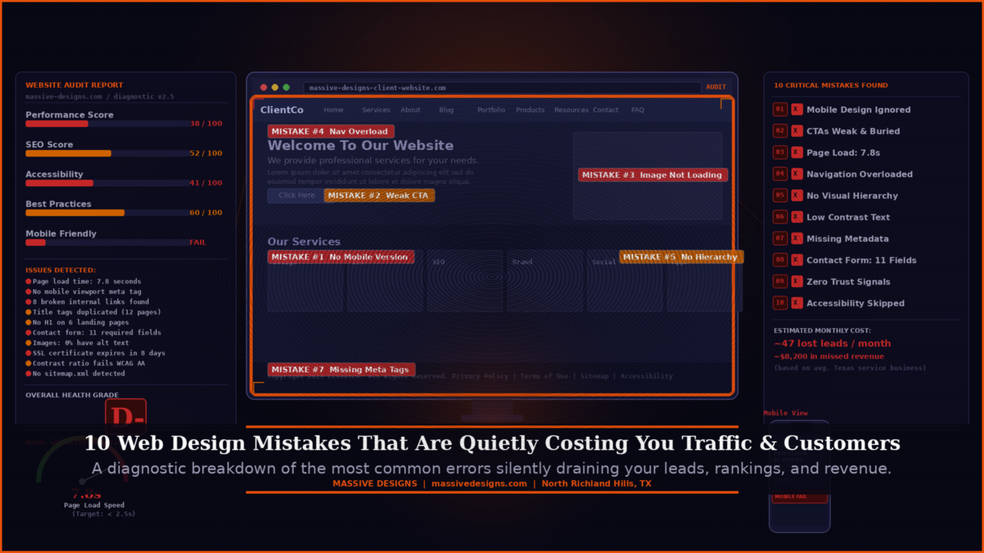
These aren’t subtle problems. They affect how many people find your website, how many of those visitors stay long enough to understand what you offer, and how many of them take the next step. Below are ten of the most common web design mistakes still appearing on small and mid-sized business websites in Texas, along with what to do about each one.
Why Design Mistakes Are Harder to Spot Than You’d Expect
Unlike a broken link or a 404 error, most design problems don’t announce themselves. They just quietly reduce how many visitors stay, how many trust you enough to get in touch, and how well Google evaluates the page.
The other issue is that many business owners review their own website from a position of familiarity. They already know where to find the contact form, what the navigation labels mean, and how the services are organized. A first-time visitor has none of that context, and the experience is often completely different.
That gap between how the site feels to the person who built it and how it feels to someone arriving for the first time is where most of these mistakes live.
1. Mobile Design Gets Treated as an Afterthought
There’s a meaningful difference between a website that is technically “mobile responsive” and one that was actually designed with mobile users in mind. The first simply means the layout doesn’t break on a phone screen. The second means someone genuinely thought through what it’s like to navigate the site using a thumb, on a four-inch screen, probably while doing something else.
When a site is designed on desktop and then “made responsive” after the fact, the results are usually predictable. Text that looks comfortable at a large viewport becomes dense and difficult to read on a phone. Buttons that seem well-spaced on a monitor end up too close together to tap accurately. Images that work at full width get cropped awkwardly at smaller sizes. Navigation that makes sense with a cursor becomes frustrating without one.
Google has used mobile-first indexing since 2023, meaning the version of your site it primarily evaluates and ranks is the mobile version. If that version delivers a poor experience, it affects your search visibility regardless of how good the desktop version looks.
| Fix: Open your website on your actual phone, not a simulator. Try to navigate to your main service, find the contact form, and tap the phone number. If anything is difficult, you’ve found the problem. |

2. Calls-to-Action That Blend Into the Page
The call-to-action is the moment a visitor decides whether to take the next step or leave. Despite that, many business websites bury their main CTA at the bottom of a long page, use buttons with text so vague that visitors don’t know what they’re clicking, or scatter three or four different CTAs across the same page in a way that dilutes all of them.

“Learn More” and “Click Here” are the most common offenders. They tell the visitor nothing about what comes next. Specificity matters here more than most people expect. “Request a Free Website Audit,” “Schedule a 20-Minute Call,” and “See Our Recent Projects” all perform better than generic alternatives because the visitor knows exactly what they’re agreeing to before they click.
Placement matters just as much as wording. A CTA that appears only once, at the bottom of a 1,200-word service page, will be seen by far fewer people than one that appears early in the page, again partway through, and once more at the end.
| Fix: Review each main page and confirm there is one primary next step that’s clearly visible without scrolling. If the CTA appears once at the bottom of a long page, add it higher. |
3. Slow Load Times That Lose Visitors Before They See Anything
Page speed affects both user experience and search performance. Google’s Core Web Vitals are a set of user-experience metrics, including how quickly the main content loads, how quickly the page becomes interactive, and how stable the layout is as it loads, that feed directly into how the page is ranked.
Research from Google found that the likelihood of a visitor leaving increases by 32% when load time goes from one second to three seconds. Beyond three seconds, that percentage climbs sharply. Many small business websites load in five to eight seconds on mobile connections, which means they’re losing a significant portion of potential visitors before anyone has read a single line.
The most common causes are uncompressed images (often the largest single contributor), too many third-party scripts loading on every page, outdated hosting infrastructure, and plugins or widgets that add page weight without providing proportional benefit.
| Fix: Run your site through Google PageSpeed Insights (free, at pagespeed.web.dev). The report prioritizes issues by impact. Image compression and browser caching usually produce the fastest improvement. |

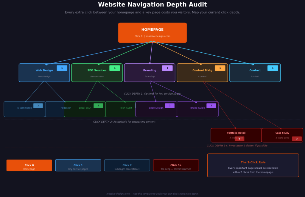
4. Navigation That Requires Visitors to Figure Things Out
Navigation problems usually come from organizing a website around how the business owner thinks about the company, rather than how a customer thinks about their problem. A services dropdown with eight categories and three levels of depth may seem thorough from an internal perspective. To a first-time visitor trying to figure out whether this business does what they need, it reads as complexity.
Users don’t browse websites the way they might browse a library. They scan quickly, click on whatever looks most relevant, and leave if they don’t find what they’re looking for within a few seconds. Navigation that slows that process, even slightly, increases the chance of losing that visitor.
Mega-menus and multi-level dropdowns are worth reviewing carefully. If a service page is more than two clicks from the homepage, consider whether there’s a shorter path worth creating.
| Fix: Ask someone unfamiliar with your business to find your most important service page, your pricing or packages page, and your contact form. Watch without guiding them. The places they hesitate or get confused are the navigation problems. |
5. No Clear Visual Hierarchy on Key Pages
Visual hierarchy is the arrangement of elements on a page in a way that guides a reader’s eye from the most important information toward the supporting details. When it works, visitors understand the message and the next step without consciously thinking about either one. When it doesn’t, every element on the page competes for attention and the visitor ends up absorbing very little.
The most common version of this problem is homepage design where the hero section, the service overview, the testimonials, the team section, and the contact form all have similar visual weight. Nothing is clearly the most important thing. The visitor’s eye moves around the page without landing anywhere useful.
Good hierarchy uses size, contrast, spacing, and position deliberately. The headline commands attention. The subheading reinforces it. The body copy explains. The CTA closes.
| Fix: Look at your homepage for five seconds without reading any of the text. What element draws your eye first? Second? If you can’t answer both questions in five seconds, the hierarchy needs attention. |

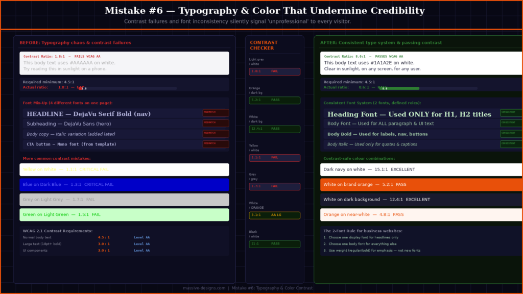
6. Typography and Color Choices That Undermine Readability
Light gray text on a white background is a common design choice that looks clean in a mockup and fails in the real world. It reduces contrast, fails accessibility guidelines for users with any degree of visual impairment, and becomes essentially unreadable on a phone screen in anything other than perfect lighting conditions.
The Web Content Accessibility Guidelines (WCAG) recommend a minimum contrast ratio of 4.5:1 for normal body text. Many business websites fall well below this without anyone noticing until someone points it out.
Font selection creates a similar problem when it grows without a system. A website that started with two fonts and picked up a third during a redesign, and a fourth when someone added a new section, ends up visually inconsistent in a way that registers as a credibility issue to visitors, even if they couldn’t explain why.
| Fix: Check your text contrast using the WebAIM Contrast Checker (free, at webaim.org/resources/contrastchecker). If your body text doesn’t pass, increasing the darkness of the font color is usually the simplest fix. |
7. Metadata That’s Missing, Duplicated, or Generic
Title tags and meta descriptions are among the most fundamental SEO elements, and also among the most commonly neglected on small business websites. The problems tend to fall into three categories: pages that share the same title tag (often the site name, nothing else), meta descriptions that are auto-generated from the first sentence of content, and title tags that include the brand name but no description of what the page is actually about.
Each page on your website should have a unique title tag that describes the page’s subject and includes the relevant search term for that page. Title tags influence how your page is labeled in search results. Meta descriptions don’t directly change rankings, but they affect whether someone clicks, a well-written description for a page that ranks in position four can generate more traffic than a generic one at position three.
For local businesses, the title tag is also an opportunity to include location. “Web Design Services in Fort Worth, TX” is more specific and more likely to match local search intent than “Web Design Services” alone.
| Fix: Use Google Search Console to check for duplicate or missing title tags. If you’re on WordPress, Yoast SEO or Rank Math make editing metadata accessible. Write each title tag as if it’s the only sentence a search visitor will see before deciding whether to click. |

8. Contact Forms With Too Many Fields
Every required field added to a contact form reduces the number of people who complete it. This pattern is consistent across industries and well-documented in conversion rate research. A form asking for a name, email, phone number, company name, budget range, project timeline, and how you heard about us will consistently generate fewer submissions than a form asking for a name, email, and a brief description of the project.
The instinct to collect detailed information upfront makes sense from a sales process perspective. In practice, however, a lead who submits a short form is more useful than the zero leads generated when the longer form feels too demanding to fill out.
The additional information can be gathered during the follow-up call or email exchange. The purpose of the contact form isn’t to pre-qualify leads before you’ve spoken with them. It’s to get someone to raise their hand.
| Fix: Count the required fields in your current contact form. If there are more than four, identify which ones are genuinely necessary for the first touchpoint and which ones can wait for the conversation that follows. |

9. Too Few Trust Signals — or None at All
A service business website without social proof is asking visitors to take a significant leap of faith. Reviews, specific client testimonials, case studies with measurable results, portfolio examples, years in business, and certifications all answer the unspoken question every new visitor is asking: “Why should I trust this company?”
This matters more for service businesses than for product businesses, because the purchase decision typically involves committing time, money, and access before seeing any result. Someone hiring a web design agency or a digital marketing firm is making a judgment call based largely on perceived credibility, and that credibility has to be demonstrated on the site.
Generic testimonials with no specifics carry less weight than most business owners assume. “Great service, highly recommend!” doesn’t tell a prospect anything about what to expect. A testimonial that describes a specific outcome — traffic increase, leads generated, timeline met, problem solved — does the work that the first version can’t.
| Fix: Identify your three strongest proof points and make sure they’re on your homepage and main service pages. Consider moving testimonials out of a standalone section and placing them near the CTA where they’re actually needed to build confidence. |

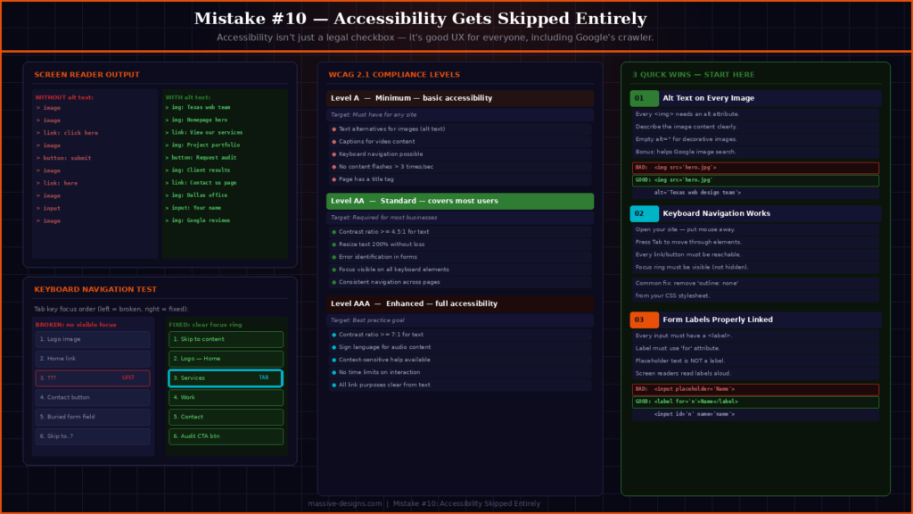
10. Accessibility Gets Skipped Entirely
Web accessibility is often treated as a legal concern relevant mainly to large companies. In practice, building an accessible website produces a better experience for a much wider group of users than most people account for.
Someone using their phone in direct sunlight, someone with a temporary injury that limits how they can hold a device, someone on an older phone with a smaller screen — these are all accessibility cases. Screen readers, keyboard navigation, captions on video, and descriptive alt text on images all make the site more usable in a wider range of circumstances.
From an SEO perspective, alt text is used by search engine crawlers to understand image content, which contributes to image search visibility and helps establish page context. Proper heading structure (H1, H2, H3 used in logical order) helps crawlers parse the page hierarchy and is also a basic accessibility requirement.
The WCAG 2.1 guidelines are the current standard for web accessibility. Meeting Level AA compliance addresses the most significant accessibility gaps without requiring a complete site rebuild for most businesses.
| Fix: Start with the basics: add descriptive alt text to every image, confirm the site can be navigated using only a keyboard, and ensure all form labels are properly associated with their fields. These three changes address the most common gaps. |
What These Mistakes Have in Common
Looking at this list as a whole, most of these problems trace back to the same source: design and development decisions made in isolation, without testing how a real visitor actually uses the site.
A mockup looks good on screen during a client presentation. That doesn’t tell you whether the navigation makes sense to someone who doesn’t already know your business, whether the page loads in time to hold a mobile visitor’s attention, or whether the contact form is getting in the way of the leads you’re trying to generate.
Testing matters at least as much as design. Speed tools, contrast checkers, form analytics, and session recording software are all inexpensive ways to replace assumptions with data. A brief usability test with a few people who’ve never seen your site before will surface more actionable information than most internal reviews.
If your website was built more than two to three years ago and hasn’t been audited since, there’s a reasonable chance it has several of the issues above. The good news is that most of them don’t require a full redesign to fix. They require someone to look at the site clearly and prioritize what’s actually affecting performance.
Working With a Team That Treats Design and Performance as One Problem
Most of the mistakes in this post come from a disconnect between how a site looks and how it performs. Design decisions made without considering search behavior affect rankings. SEO work done without attention to user experience generates traffic that doesn’t convert. Closing that gap requires designers and strategists working from the same goals from the beginning.
At Massive Designs, web design and development projects start with structure before aesthetics. Navigation, page hierarchy, load performance, and metadata are built into the process from the wireframe stage rather than addressed as an afterthought at the end. That same thinking extends into the SEO and content work that follows.
If your website is underperforming and you’re not sure which of these issues applies to you, start with a review of your current setup. Our web design and development services account for search and user experience from day one, and our SEO services extend that work into ongoing technical and content optimization. If you’d like a clear-eyed look at what’s actually affecting your site’s performance, get in touch with our team, we’ll tell you what we see and what we’d prioritize.