A significant number of contractor websites across the Dallas market share the same hidden issue. At first glance, everything seems to be in place, the design looks professional, the pages load properly, and the contact information is easy to find. But once you look at the analytics, a different story starts to appear. Visitors land on the site, scroll through a few sections, and leave without calling, filling out a form, or taking any meaningful action.
Well, that is not a traffic problem. It is a conversion problem.
The homeowner who just searched “roof repair estimate Dallas” is not browsing. They are shopping with urgency. They found your website because they need someone. The job of your website, at that moment, is to remove every possible reason for them to click back and call someone else.
This is what conversion-focused web design actually means for contractors. Not prettier fonts or a new color palette. It means designing around how buyers actually behave when they need a roofing crew, a remodeling company, or an HVAC tech. If you want to understand what separates a website that generates 30 leads a month from one that generates five, these seven elements are where the gap lives. And if you are looking for a web design agency in Longview Texas or across the Dallas market that builds with this strategy in mind, the same principles apply regardless of city.
1. The First Five Seconds Decide Whether the Phone Rings

When someone lands on a contractor website from a Google search, they make a judgment in seconds. Not about your prices or your portfolio. About whether you look like a real company worth calling.
That judgment depends almost entirely on what is visible without scrolling. The above-the-fold section needs to answer three questions immediately: What do you do? Where do you serve? How do I reach you right now?
A headline like “Quality Work You Can Trust” fails all three. Compare it to: “Licensed Roofing Contractor Serving Dallas, Plano, and Frisco. Free Estimates. Call Now.” The second version creates immediate context and a clear action path.
The phone number should be visible, large, and clickable. On desktop, that means top-right placement at minimum. On mobile, a sticky click-to-call button is not optional. According to data from BrightLocal, over 60 percent of service-business searches happen on mobile devices, and the most common next action after a search is a direct phone call. If your phone number requires any scrolling or hunting, you are leaking leads at the very first touchpoint.
Hero images also carry weight here. A photo of your actual crew on an actual job site in the DFW area will always outperform a stock photo of a smiling couple in a hardhat. Buyers want to see evidence, not illustration.
2. Estimate Request Behavior Is Different From General Contact Behavior
Most contractor websites have a single contact form that says “Name, Email, Message, Submit.” This form is designed for someone who wants to send a letter. Contractors do not need letters. They need estimate requests.
Homeowners who want an estimate are ready to move. But they have specific information on their mind: the job type, the address, the timeline, the budget range. A generic form creates friction because it gives them no structure to communicate what they actually want to say.
An estimate-specific form with fields like “Type of Project,” “Approximate Square Footage or Scope,” and “Preferred Contact Time” does two things. It collects better lead data on your end, and it signals to the visitor that you take their request seriously and that you are organized. That signal has a direct effect on whether they hit submit.
Form abandonment on contractor websites is heavily influenced by field count. Asking for too much information kills completion rates. Keep the mandatory fields to four or five maximum. Optional fields can be added without hurting conversion because users skip what they do not want to fill out.
One more detail worth controlling: what happens after submission. A blank page refresh or a generic “Thank you” message is a lost opportunity. A confirmation that says “We will call you within 2 hours during business hours” creates an expectation and builds immediate trust.
3. Mobile Friction Is Where Most Contractor Websites Lose

The homeowner whose pipe burst at 9 PM is not on a laptop. Neither is the person who saw your truck on the job site and wants to check your reviews before calling. Mobile visitors for local service businesses are often the highest-intent visitors you get, and yet most contractor websites treat mobile as an afterthought.
Mobile conversion friction shows up in specific ways. Buttons too small to tap confidently. Pop-ups that cover the screen and do not close cleanly. Forms that require zooming in to fill out. Phone numbers that are plain text instead of clickable links. Navigation menus that take three taps to navigate.
None of these are expensive to fix, but they each add resistance at the exact moment someone is ready to act. The cumulative effect is that a motivated visitor gives up before they become a lead.
Page speed compounds the problem. Google’s Core Web Vitals data consistently shows that pages loading slower than three seconds on mobile see significantly higher bounce rates. For a contractor in a competitive Dallas suburb, where three other companies are just as easy to find, a slow-loading mobile site is a direct handoff of business to a faster competitor.
The Massive Designs web design and development service for Texas contractors is built mobile-first by default, not retrofitted after the desktop version is done. That distinction in process makes a real difference in mobile performance.
4. Before-and-After Galleries Are Your Strongest Sales Tool
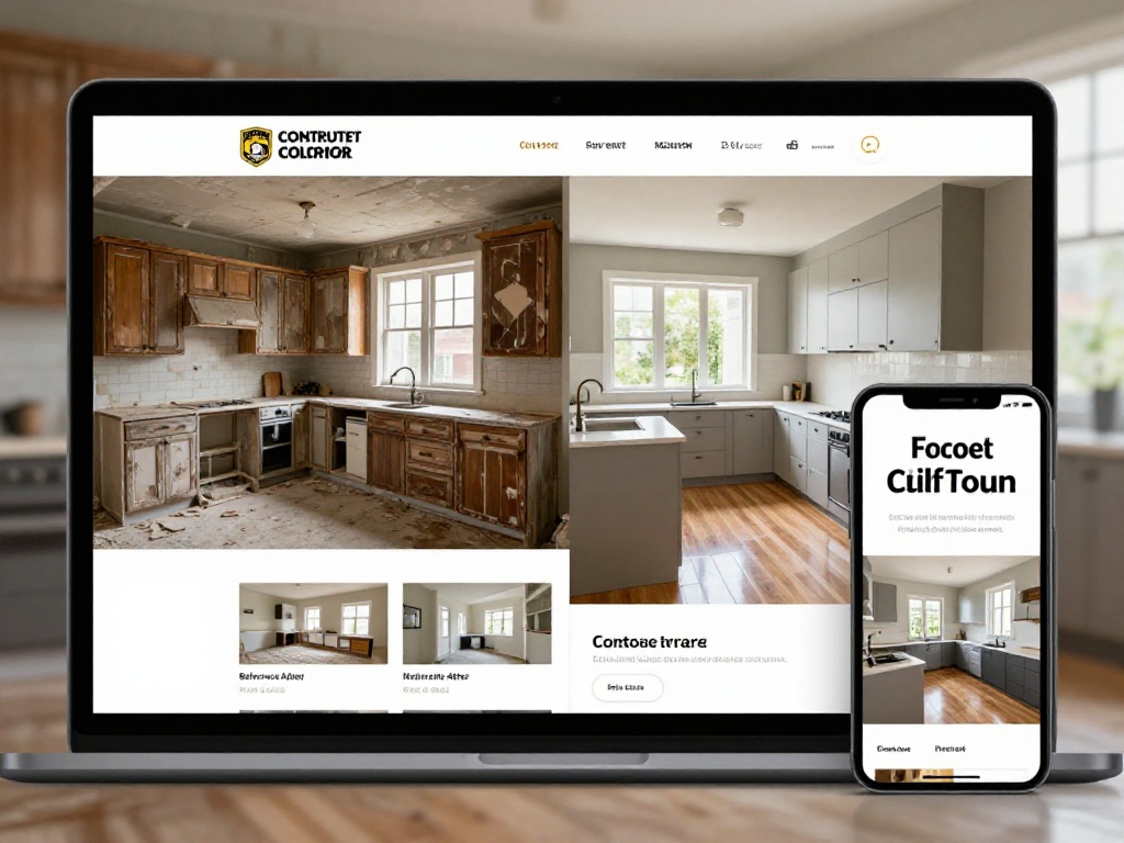
Contractors sell outcomes that are hard to describe in words. A remodeled kitchen, a repaired roof line, a freshly painted exterior. The most efficient way to communicate the value of your work is visual evidence.
Before-and-after photo galleries convert better than any block of text because they compress the entire buying argument into a single image pair. The homeowner sees exactly what their problem looks like, then sees what it looks like when you solve it.
The gallery placement matters. Project photos buried three or four scrolls down a page will not perform as well as a gallery positioned immediately after the hero section or the first trust section. Visitors who are evaluating you need to see work quality early. If they have to search for it, many will not bother.
Photo quality matters more than volume. Ten sharp, well-lit, clearly labeled before-and-after photos of real jobs in Dallas or surrounding areas will outperform fifty blurry generic images. Tagging project locations in captions also serves a secondary SEO benefit: it reinforces your geographic authority in the areas you actually serve.
Video walkthroughs of completed projects are even more persuasive when done well, but they require more investment. If you are choosing between improving your photo gallery or adding a video, fix the photos first.
5. Trust Indicators Homeowners Actually Check
The trust signals that matter to homeowners shopping for contractors are not abstract. They are specific, and they are looking for them in particular places.
Licenses and Insurance
Texas requires contractors in specific trades to hold active state licenses. Displaying your license number and confirming you carry general liability and workers’ compensation insurance is not just a credibility signal. For many homeowners, it is a basic qualification checkpoint. If this information is missing from your website, a portion of your visitors will assume the worst.
Google Reviews and Ratings
According to BrightLocal’s Local Consumer Review Survey, the majority of consumers read between one and six reviews before forming an opinion about a local business. Embedding your Google rating with a current review count directly on your homepage removes the need for a visitor to leave your site to find this information. Every time they leave your site to verify something, there is a chance they do not come back.
Years in Business and Local Presence
Dallas homeowners, especially those managing larger renovation projects, weight longevity heavily. A company that has operated in the DFW area for twelve years carries implicit reliability. Surface this information prominently. “Family-owned, serving Dallas and East Texas since 2011” is a stronger trust signal than a generic “About Us” section.
Named Staff and Real Photos
Contractor websites that show actual people, the owner, the crew lead, the estimator, consistently outperform faceless company pages. People are hiring a company, but they are also deciding whether they are comfortable letting strangers into their home. A real face changes that dynamic.
6. Service Area Pages Do More Work Than a Generic Contact Page
Many contractor websites have a single contact page and a general “We serve the DFW area” line buried in the footer. This approach leaves significant lead generation on the table.
A dedicated service area strategy means creating individual pages for your highest-priority markets. For a contractor based in Dallas proper, that might include separate pages for Plano, Frisco, Allen, Longview, Mesquite, and so on. Each page is structured around that city’s search behavior, specific neighborhoods, and project types common to that area.
These pages serve two purposes. First, they rank for location-specific searches that a single generalized page cannot capture. Second, they give a visitor from Plano the experience of landing on a page that feels like it was written for them rather than for a vague regional audience.
The content on service area pages should not be a copy-paste job with the city name swapped. Each page needs unique content: local landmarks, specific project examples from that area, and ideally, a testimonial from a customer in that city. This is more work upfront, but it compounds over time in both SEO and conversion value.
This is a pattern Massive Designs implements across Texas web design projects for service-based clients who operate across multiple cities. The difference in lead volume for clients who have proper service area pages versus those who rely on a single contact page is consistently significant.
7. Fast Contact Pathways Remove the Last Barrier
After all the other elements are in place, the final conversion bottleneck is often the simplest one: how hard is it to actually reach you?
Fast contact pathways mean multiple options presented clearly and without friction. A prominent phone number that works as a click-to-call link. A short estimate form on the homepage, not just a buried contact page. A live chat option if you have the capacity to staff it. A text-message link for mobile visitors who prefer texting to calling.
Offering only one contact method is a conversion leak. Not every homeowner wants to call. Some prefer to fill out a form at midnight when they are assessing the project. Others want to text a quick question before deciding to commit to a full estimate conversation. The contractor website that accommodates all of these behaviors captures more leads than the one that demands a phone call.
The placement of these contact options should not rely on the visitor finding them organically. A sticky header with click-to-call, a CTA button midway through each long page, and a bottom-of-page contact section create multiple natural off-ramps at every stage of a visitor’s scroll.
One detail that gets overlooked: make your business hours visible. A homeowner who finds your website at 10 PM wants to know whether calling makes sense right now or whether they should set a reminder for tomorrow morning. Displaying hours next to your phone number prevents a visitor from abandoning after getting no answer and assuming you are not responsive.
The Compounding Effect: Why These Elements Work Together
None of these seven elements operates in isolation. A fast mobile experience means nothing if the visitor lands on a page with no trust signals and a generic form. A beautiful before-and-after gallery loses impact if there is no clear contact pathway adjacent to it.
The contractor websites that consistently generate strong lead volume in the Dallas and East Texas markets are the ones where all of these elements function together as a system. The visitor is moved from landing to trust to action without encountering friction at any point along the path.
Achieving that requires a design process that starts with buyer behavior rather than aesthetics. The visual quality of the site matters, but it is in service of the conversion strategy, not a substitute for it.
If your current contractor website is not converting visitors at the rate your business deserves, reviewing these seven elements is the right starting point. The Massive Designs web design team in Texas works with local contractors and service businesses across Dallas, Longview, and surrounding markets to build websites designed around this kind of conversion strategy. Learn more about our approach and pricing packages here.