
When someone in Texas searches for a personal injury attorney, a family law firm, or a business litigation practice, they rarely call the first result. They evaluate. They visit your website, scan your logo, read your Google Business Profile, and do look at your attorney’s photos. Other than that, they judge the color of your header and whether your font feels confident or careless.
Most of that happens in under ten seconds. And it happens before they ever read a single line about your qualifications.

That silent evaluation is where law firm branding either works or quietly fails you. And for firms competing in crowded Texas legal markets like Houston, Dallas, Austin, and even fast-growing suburban corridors like Pearland and Sugar Land, it is one of the most underestimated factors in new client acquisition.
This guide is not about picking a logo. It’s about understanding why your brand communicates credibility before your credentials ever get a chance to.
Why Legal Branding Is Fundamentally Different From Other Industries
A restaurant can build trust through photos of food. A gym can earn attention through transformation results. But a law firm sells something more abstract and more high-stakes: the belief that you will protect someone during one of the most difficult moments of their life.

That psychological context changes everything about how branding works in the legal space.
Legal clients are not casual browsers. They arrive stressed. They are searching for a divorce attorney during a marriage breakdown, a criminal defense lawyer after an arrest, or a personal injury firm after an accident. Their emotional state is heightened. Their decision-making is fast. And their sensitivity to trust signals is acute.
A Cilo 2025 legal trends report found that reputation drives the hiring decision for 43% of legal clients, outranking both price and proximity. Reviews matter to 30% of clients. Experience with similar cases matters to 40%. Not one of those factors is discovered before a client first sees your brand. But every single one of them is filtered through the lens of whether your brand makes them feel like your firm can be trusted.
That is the job of brand identity in the legal industry: to reduce perceived risk before the conversation even starts.
The Trust Hierarchy: What Texas Legal Clients Actually Evaluate First
Understanding what clients see and in what order is the foundation of intelligent legal branding.
When someone lands on a Texas law firm’s website for the first time, their brain runs a fast, largely unconscious assessment. Research from Carleton University on web credibility confirms this initial impression forms in as little as 50 milliseconds, before a single word on the page is consciously processed:
Visual coherence — Does the design feel intentional or cobbled together? Color tone — Does the palette signal stability, aggression, warmth, or competence? Typography legibility — Does the font feel professional and readable, or dated and difficult? Photography quality — Do attorney photos look like real professionals, or stock images? Consistency — Does the site look like one unified firm, or like three different designers touched different pages?
Only after that initial filter does a client begin reading your practice areas, your case results, your testimonials, and your contact information.
This is the trust hierarchy. Visual brand signals precede verbal trust signals. If your brand fails the visual test, your content rarely gets a fair reading.
Logo Design — What It Communicates Before Anyone Reads a Word
Your logo is not a decorative element. It is your firm’s most condensed credibility signal. In a fraction of a second, it tells a potential client whether your firm has invested in its own presentation, which, consciously or not, they interpret as a signal of how seriously you will treat their case.
For Texas law firms, a poorly executed logo creates a specific problem: the legal market here is dense and highly competitive. Houston alone is home to thousands of licensed attorneys. Dallas has a sophisticated corporate client base with high visual expectations. When your logo looks like it was created with a free online tool or hasn’t been updated since 2009, it doesn’t just look old. It looks like you don’t compete at the level the client needs. If you are unsure where your current logo stands investment-wise, understanding the real cost of professional logo design in 2026 will show you exactly what each tier delivers, and what it costs your brand when it falls short.
A well-designed law firm logo does several things at once:
It signals your practice area’s energy. A personal injury firm and an estate planning firm should not have the same visual tone. Urgency, aggression, and advocacy read differently than precision, care, and legacy. Your logo should lean into the emotional register of the work you actually do.
It scales without distortion. A strong law firm logo works on a billboard and in a mobile browser header. It works in black and white. It works on a business card and in a Google Business Profile thumbnail. Logos that only look acceptable at one size are functionally limited.
It separates you from the visual noise. In the Texas legal market, navy blue and serif fonts are everywhere. That is not an accident because those choices signal tradition and authority. But when every competing firm makes the same choice, the signal disappears. A thoughtful branding service will help you differentiate within the credibility range, not just duplicate what everyone else is doing.
Color, Typography, and the Psychology of Legal Credibility
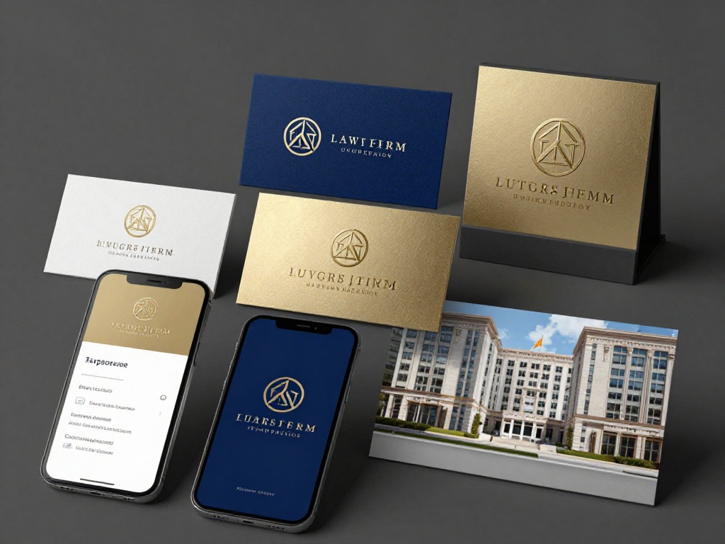
Color and typography are not aesthetic preferences. They are psychological instruments that your brand either uses deliberately or leaves to chance.
Color psychology in legal branding:

Dark navy blue signals trustworthiness, stability, and depth of experience — useful across practice areas from corporate law to family law. Deep green communicates precision, judgment, and long-term thinking — strong for estate planning and business law practices. Rich charcoal gray or slate tones signal modern professionalism without the traditional rigidity of navy — effective for boutique firms targeting younger clients or tech-sector businesses. Red and black create urgency and aggression — powerful for personal injury and criminal defense where decisiveness matters most to clients.
The mistake most Texas law firms make is not the wrong color. It is inconsistent. Your primary color on your website should match your logo. Your logo should match your business card. On top of that, your business card should match your email signature. The moment a client encounters two different shades of blue across your materials, the cohesive brand experience fractures — and so does their unconscious confidence in your firm’s attention to detail.
Typography:
In 2026, there is a visible shift happening in legal typography. Traditional serif fonts — the ones that reference academic institutions and old law school buildings — are giving way to clean, modern sans-serif options that read better on mobile screens. This matters because over 60% of legal website traffic now arrives on mobile devices.
This does not mean your firm needs to look like a tech startup. It means your typography should feel authoritative and contemporary at the same time. The goal is not to abandon professionalism. The goal is to reflect the level of professional competence that today’s clients expect from a firm operating in 2026.
Digital Brand Consistency: Your Website, Google Profile, and Social Presence
Here is where the majority of Texas law firms lose ground even after investing in a decent logo.
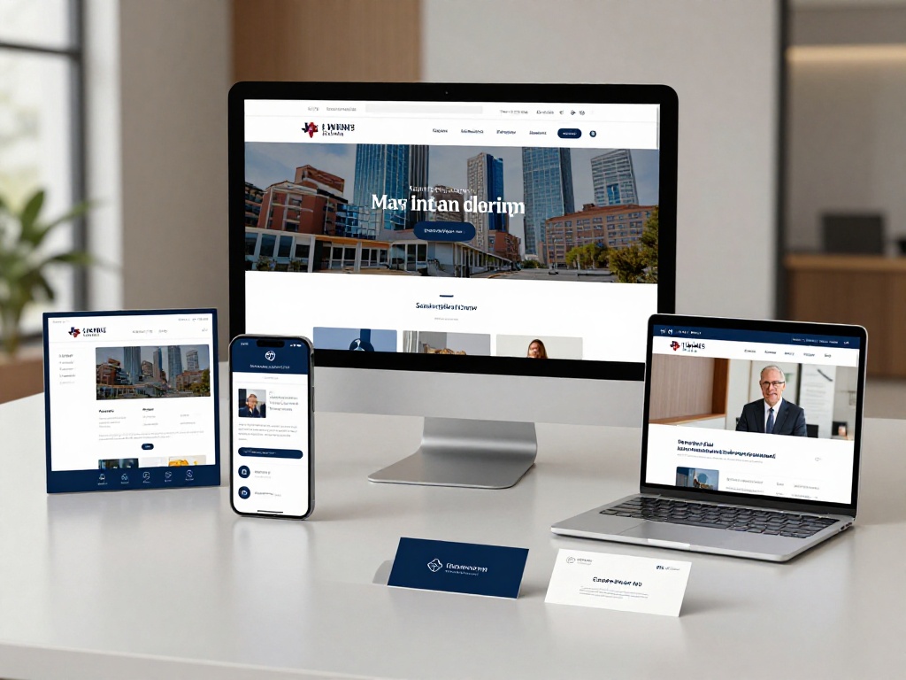
Brand identity is not a single asset. It is a system. And the system only works when every client-facing touchpoint uses the same visual language.
The failure chain looks like this: a firm invests in a solid logo and a professional website design. Then, three months later, someone updates the Google Business Profile with a photo that uses a different font for the firm name. A paralegal creates a social media post using a template pulled from Canva in colors that don’t match the palette. The attorney’s LinkedIn banner still uses the old logo from 2017. A client who touches three of these touchpoints in sequence, i.e, website, Google profile, LinkedIn, encounters three slightly different versions of the same firm. The inconsistency registers. Trust erodes.
What consistency means across digital touchpoints:
Your website should carry the logo, primary colors, and typography system without deviation. The photography style, professional headshots, office images, or lifestyle imagery should feel cohesive across every page.
Your Google Business Profile is often the first visual impression clients form, since it appears prominently in local search results before they click through to your website. The logo, cover photo, and content should feel like a direct extension of your site.
Your social media presence does not need to be elaborate. But it should use your brand colors and fonts consistently. Even sporadic social activity with consistent visual branding reinforces recognition.
Your email signatures and document templates are internal brand touchpoints that clients encounter throughout their engagement with your firm. Professional letterhead, branded intake forms, and consistent email formatting tell a client at every stage that they made the right choice.
This total brand system is what separates law firms that look like they belong at a certain fee level from firms that don’t.
The Texas Legal Market: Why Generic Branding Costs You Cases
Texas is the second-largest legal market in the United States. Houston is home to some of the most sophisticated commercial litigation practices in the country. Dallas has a robust corporate and real estate legal sector. Austin’s rapid growth has produced a dense market of emerging firms competing for both startup clients and established individuals relocating from other states.
In that environment, a generic brand is not neutral. It is a liability.
Potential clients in these markets have already seen dozens of law firm websites before they reach yours. They have a subconscious benchmark for what a credible Texas firm looks like. When your branding falls below that benchmark, whether through an outdated logo, inconsistent color use, low-quality photography, or a website that doesn’t translate well to mobile, you are not just missing an opportunity. You are actively confirming a client’s hesitation.
The suburban growth corridors are equally important. Pearland, Sugar Land, Katy, and The Woodlands are expanding markets where smaller and mid-sized firms can build a dominant local presence, but only if their brand communicates the same quality standard that clients would expect from a Houston firm. Local does not mean low-quality. For clients making high-stakes legal decisions, the bar is the same whether they are searching in downtown Houston or in the Pearland zip code.
The Hidden Conversion Cost of a Weak Brand
Most law firm partners think about branding as a cost. The more useful frame is to think about what weak branding costs in lost conversions.
Consider the search journey of a personal injury client in Austin, Houston, and Dallas, Texas. They search, find three or four firm websites. They spend less than a minute on each. Two firms have clean, professionally branded websites with strong logos and consistent visual identity. One looks outdated, with a pixelated logo and an inconsistent color scheme across pages.
The client’s brain will not consciously say “their logo quality is inferior.” It will simply translate that visual impression into a trust shortcut: this firm doesn’t look like the caliber I need right now.
That shortcut is not irrational. Attention to professional presentation is often correctly read as a signal of attention to professional process.
Research confirms that clients consistently cite reputation as the dominant factor in legal hiring decisions. Brand is the foundation on which reputation is perceived before direct experience. You cannot build a strong reputation signal if the visual identity that frames it looks careless.
What a Strong Branding and Logo Design Service Delivers for Texas Firms
A professional branding and logo design service for a Texas law firm is not just a graphic design engagement. It is a strategic positioning exercise.

The right service will begin with questions about your practice area, your target client, your competitive set, and your positioning. It will analyze what the dominant visual language in your market looks like, and identify where differentiation creates advantage. It will develop a logo that works across every channel and every format your firm uses.
Beyond the logo, a comprehensive branding engagement for a Texas law firm typically includes:
Brand strategy and positioning — defining what makes your firm distinctive in the market, and encoding that distinctiveness into the visual and verbal identity.
Color palette and typography system — a cohesive set of visual standards that can be applied consistently by anyone who creates materials for your firm.
Brand guidelines — a documented reference that prevents inconsistency as your firm grows and team members change.
Website design alignment — ensuring your digital presence reflects the brand at full quality, from header to footer, including mobile experience.
Collateral templates — business cards, letterhead, email signatures, and intake materials that carry the brand system through the full client experience.
The output is not a logo file. It is a brand system your firm can operate from with confidence.
How to Know It’s Time to Rebrand Your Firm
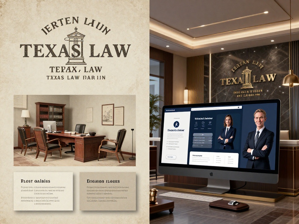
Not every Texas law firm needs a complete rebrand. But certain signals clearly indicate that your current brand is working against you:
Your logo looks visibly different from your competitors’ and not in a way that creates advantageous differentiation. It simply looks older or lower quality.
Your website and your physical collateral don’t match. Clients who receive your business card and then visit your website encounter two different visual identities.
You have expanded your practice areas or geographic presence and your current brand no longer represents the full scope of what your firm does.
You are moving upmarket or targeting a higher-fee client profile, and your existing brand was designed for a different audience at a different price point.
Your firm has merged or rebranded its name, and the visual identity was never formally updated to match.
Any one of these is sufficient reason to engage a professional branding service. Delaying a rebrand in a competitive market does not save money. It defers revenue.
Brand Is Not Decoration. It’s the First Decision.
The client who hires your firm never consciously decided to evaluate your logo. But their brain did it anyway. Long before they read your case results, long before they see your attorney biographies, long before they make contact — they have already made a preliminary judgment about whether your firm is worth their trust.
That judgment is shaped by your brand.
For Texas law firms operating in competitive markets from Houston and Dallas to the growing suburban corridors of Pearland and Sugar Land, brand identity is one of the few controllable factors in the client acquisition process. You cannot control what your competitors charge or how many reviews they accumulate. You can control how your firm looks, how consistently it presents itself, and whether your visual identity communicates the level of professionalism your clients are looking for.
A professional branding and logo design service in Texas gives you the foundation to compete on credibility — not just credentials.
If your current brand is working against that goal, the right time to change it was last year. The second best time is now.
Ready to build a brand that earns trust before the first call? Explore Massive Designs’ Texas branding and logo design services for your business.